New Small Work now on display

This painting captures the feeling of the West over on the Western Slope of Colorado. In the distance , near the middle, stands Lands End, Mount Lamborn and Coal Mountain. On the left is the Raggeds.

Moon Over Grand Valley- 10 x 20 Oil on PanelAvailable at RAModern Gallery in Crested Butte.

Moon Over Grand Valley- 10 x 20 Oil on Panel

Available at RAModern Gallery in Crested Butte.

Moon over Lion Mesa

This new work is a miniature - 6” x 6” oil on panel. The Blue Sage Gallery, (Paonia) 6x6 Show is a fundraising effort featuring over one hundred artists. A key element of the show was - the artist’s name will appear only on the back.

MoonOverLionMesa6x6.jpg

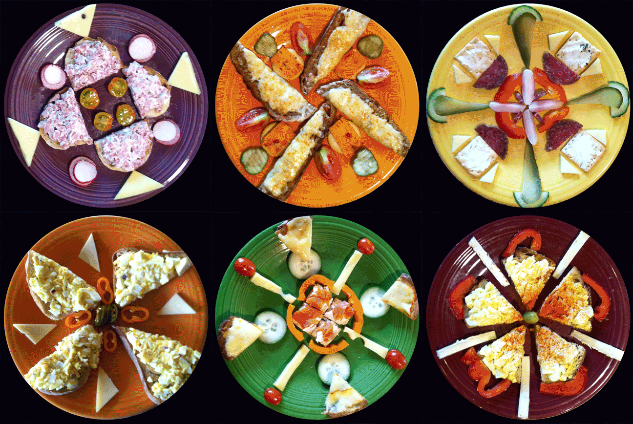
Kaleidoscopic Dinners

This is a compilation of daily dinners I made for my Father-in-Law in his nineties. He had an artistic eye so I knew my fun with geometry would be appreciated. He often would say “Oooh….fancy ! …….thank you"

Kaleidodinners.gif

Groovin' on Vinyl

Something I created back in the mid seventies when black and white book illustration was the standard. Quite fitting, really: this is an illustration about how vinyl records work! All done with a Rapidograph pen, Ship Curves on Illustration Board. Antiquated through and through. See my Technical Illustration section.

vinylrecords.jpg

Raccoona Lisa

Making art for commercial purposes was never as fun as this. PC Connnection used the Raccoon as a mascot in the formative years. Leonardo Da Vinci might not approve but here is Raccoona Lisa. She’s holding a packing peanut that will no longer to be used in shipping from PC Connection. Their home office was is Marlow, New Hampshire. “In the name of ecology peanuts are finished.”

RaccoonaLisa.jpg

Glazing Techniques

The single most important thing that makes my paintings illuminate themselves is the surface preparation. It has to be smooth. The first thing you notice about my glaze method paintings is that the color is vibrant and glowing. The effect of having light pass through glass. That is the basic concept. What is only slightly difference is that my paintings have many micro thin layers of "glass" or glaze. It's in the form of tinted clear media dried in a significant layer over a base color. I begin my development in the warm peach tones.

Progression of steps of glazing

Progression of steps of glazing

Commissioned Portrait Painting

The portrait artist has a particularly hard job. Most people are unhappy with photos of themselves. On top of the challenge of making the subject happy with a good likeness, the portrait artist needs to make a good work of art. I’ve upped the ante by wanting to capture the soul and spirit of the subject’s inner workings. A soul-selfie if you will.

This endeavor is not for the faint of heart, but with the right frame of mind and lots of input from the subject, a unique and treasured heirloom painting can come to life.

In this portrait, my wife wanted her portrait centered around the powers of the four elements and her spirit animal by her side. The time of year represents her birthday month, November. She’s holding a large healing crystal.

The Healer Oil on Panel 40 x 30

TheHealer.jpg

Commissioned work is "my jam".

When a patron asked if I could paint a vision of the Robert Frost poem “The Road Not Taken”, I was able to create this watercolor. It was given as a gift to someone who must have chosen the right path and had the poem to thank for it.

RoadNotTakenCard.jpg

The Road Not Taken

Two roads diverged in a yellow wood,
And sorry I could not travel both
And be one traveler, long I stood
And looked down one as far as I could
To where it bent in the undergrowth;

Then took the other, as just as fair,
And having perhaps the better claim,
Because it was grassy and wanted wear;
Though as for that the passing there
Had worn them really about the same,

And both that morning equally lay
In leaves no step had trodden black.
Oh, I kept the first for another day!
Yet knowing how way leads on to way,
I doubted if I should ever come back.

I shall be telling this with a sigh
Somewhere ages and ages hence:
Two roads diverged in a wood, and I—
I took the one less traveled by,
And that has made all the difference.

Commissioned work is always a dream.

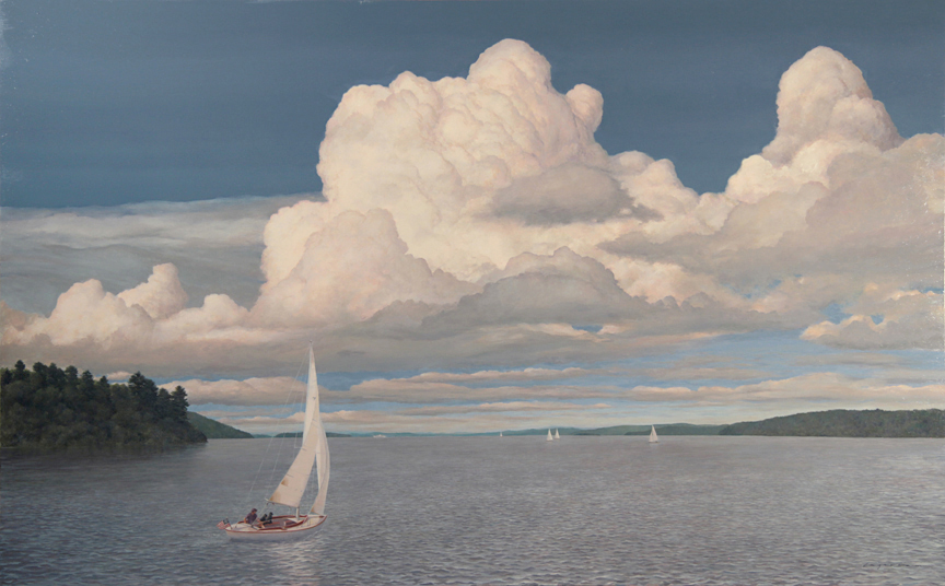
There are some artists who work hard to stay away from constraints. I, on the other hand, have been embracing “the narrative” and whenever someone needs to see a vision come into reality, I am quite willing to take my artistic experience in their direction. In this series, you’ll see many works that began as someone else’s idea and they want to hire me to bring it to life. It began with book and magazine illustration and it developed through my 14 children’s books. These days, I’m taking on large painting commissions. I like to call them Empowerment Portraits. This first painting was created for a gentleman who wanted to me to commemorate how he likes to sail with his two dogs on Lake Winnipesaukee. Since there wasn’t a good resource photo available, I had to draft the specific brand of sailboat from scratch using many reference photos.

Underway with Dogs. Oil on Panel 30 x 48

UnderwayWithDogs2.jpg
Sailboat.jpg
Final challenge: I had to figure out a way to paint in the “stays” and “sheets” (thin wires and ropes) after the painting was practically complete. They had to look tight and not have variable thicknesses.

Final challenge: I had to figure out a way to paint in the “stays” and “sheets” (thin wires and ropes) after the painting was practically complete. They had to look tight and not have variable thicknesses.

Illustrating color with pencil

My first books were created using pencil on mylar overlays. They called it “pre-separation.” The burden fell on the artist to conceive of the color and create it using only grey and black on separate overlays. The colors loaded onto the print presses and the final color combinations were first seen as the sheets came off the press. I have this original artwork on our wall. It’s the “black plate” for the cover of Cross-Country Cat.

XCC-coverart.jpg
You can see the shadow was done in an overlay called the “blue plate”.

You can see the shadow was done in an overlay called the “blue plate”.

A book award and a postage stamp!

Back in 1983, my first book in full-color, Porcupine Stew, won two awards.

One of Biennial of Illustration, Brataslava awards was given to Porcupine Stew. To commemorate the award, the Czech government issued actual postage stamps representing each of the winners. I’ve included the illustration from the book on which they were basing the stamp design.

PS-CzechStamp.jpg
SCANofHandshake-a.jpg

Channelling Frederic Church's style

Every once in a while I get a specialized assignment. Last year, a coffee table book was designed to celebrate the 250th Anniversary of Dartmouth College. One of the central pages in the book is this painting I was asked to paint in a Frederic Church painting style. Hudson River School best describes it. In this scene, when Dartmouth was only a 3 year old college, we see John Ledyard in May 1773 dropping out and heading down the Connecticut River in a dugout canoe he had fashioned himself. He was off to discover the world. He returned to Dartmouth after a life of adventure to write Journal of Captain Cook's Last Voyage. It was the first work to be protected by copyright in the United States. The original painting called “John Ledyard’s Departure” now hangs in the Baker Library at Dartmouth.

LedyardsDeparture.jpg

“I’m so pleased that you were able to pull this off, from start to finish. Thanks again for the nice work. You’ve made a rich contribution to Dartmouth’s heritage and its public art.” - Jim Collins